

Objective
The objective of this project was to rebrand Moop, a handmade leather bag company in Seattle, Washington. I created this product catalog/care guide as the primary component of the final products, as well as a postcard, website, and style guide.
The goal was to focus on the typography and striking imagery to create a clear hierarchy within the heavy amounts of text.
Approach
I tried to modernize Baskerville by combining two strikingly different typefaces with a strict grid structure throughout the catalog, as well as utilizing dramatic scale differences to create a sense of hierarchy.
You can find a PDF of this catalog to view at your leisure here:
https://drive.google.com/file/d/1QRxlUQLDokNE_Fl2u7U9XAFXRLq40G79/view?usp=sharing
https://drive.google.com/file/d/1QRxlUQLDokNE_Fl2u7U9XAFXRLq40G79/view?usp=sharing
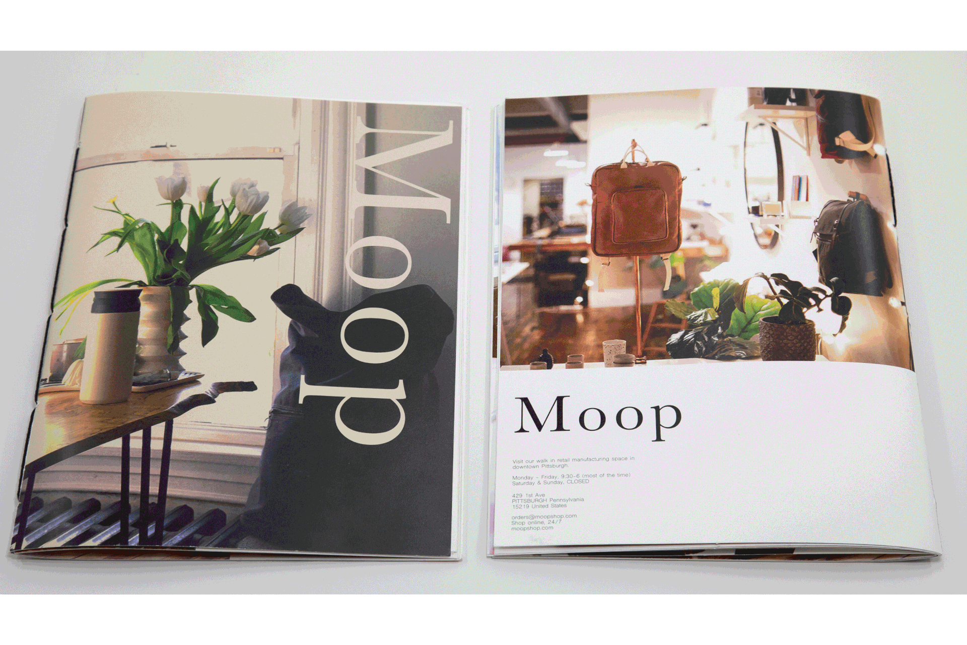
Moop product catalog/care guide


Postcard